
1. Pull inspiration from your favorite pieces
Do you already have a statement piece in the living room? Maybe a colorful rug or large artwork? Pick the colors you like from whatever your statement piece is, then decorate around those colors. Use the more neutral colors from your statement piece as inspiration for wall color.
2. Use a color wheel
Colors that go next to each other on the color wheel will seamlessly blend together in your home. It’s also important to have an understanding of complementary and monochromatic colors. We love this color wheel tool from Canva! Choose your color, then Canva will show you the complementary color to help build your palette.
3. Pull inspiration from YOURSELF
What colors do you notice hold the majority in your closet? People typically wear colors that make them happy and comfortable in their skin. Are you more of a bright, colorful person in your wardrobe? Consider using bright pops of color in your accent items like throw pillows, decor, etc.
4. The 60-30-10 rule
Decorating with a color palette can be broken down into the rule of 60-30-10.
60% – Dominant color (walls)
30% – Secondary color (upholstery)
10% – Accent color (accessories)
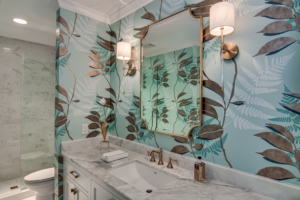
5. Emphasize the small spaces
Use a bold color or patterned wallpaper to bring attention to small spaces like offices, bathrooms, etc. Check out what we did with this bathroom:
6. Start big, finish small
Save spaces like the guest bath, office, and bedroom for last. Start with the living room, dining room, or entry way. Choose a color scheme for those areas first, then pull one color to use as an accent in more private spaces. For example, take the color fo the navy blue couch in the living room and use navy blue accents for the office and/or bedroom.
7. Connecting spaces
Keep connecting spaces (hallways, landings, etc.) a neutral color like white, beige, or gray. However, if the larger rooms of your house are neutral colors, you can use bolder colors in the hallway to create contrast between the rooms.
8. Compare your mood with seasons
Which season do you relate to the most? Consider pulling colors to match the mood/season you’re aiming for.
Spring is a creative, friendly and bright palette. Consider using pastels like greens and yellows for spring.
Summer is romantic and abstract. Muted colors like mint, navy and lavender flow well with summer.
Autumn is warm, organic and rustic. Colors to consider are reds, browns and umber.
Winter can be a strong and intense palette. Sticking to colors like blues, metallics and blacks will make a dynamic winter palette.
9. Start with a neutral and two other colors
You don’t have to stick to three colors, but starting with three colors is a great way to start building your palette. Your neutral color should be throughout the entire house to create a seamless flow of color.
10. Have fun!
In the end, there’s really no WRONG way to decorate your home if you’re happy with the outcome. At Persnickety Interiors, we share a deep passion for home decor. We love the sophisticated, the eclectic, the delightfully unexpected, and making the old new again. And we also believe that great interior design is well within everyone’s reach. Our design mission is to enhance our clients’ homes by creating beautiful, timeless, and fulfilling personal spaces – while staying true to the homeowners’ personality and always within their budget.

